Monday, January 2, 2017

Is There a Relationship Between Global CO2 Increase and El Nino? Yes and No

A number of recent articles, papers and forums have stated there is a direct relationship between strong a El Nino and higher year to year CO2 ppm rates of change. I've looked, but not found a piece that directly builds the relationship, so this post attempts to explore that relationship.

A recent blog post demonstrated the trend in the monthly global CO2 increases as one, five and ten year comparisons, through October, 2016. It was created using the NOAA/ESRL monthly global CO2 data.


What was needed to explore the relationship with El Nino or La Nina was the SST anomalies.

Curious about the relationship between ENSO 3.4 sea surface temperatures (El Nino or La Nina), I pulled the monthly ERSSTv4 (centered base periods) Niño 3.4 (5North-5South) (170-120West)) that is used to provide the monthly input to the Oceanic Nino Index (ONI). 
For the SST ENSO explanation see: http://www.cpc.ncep.noaa.gov/data/indices/ 

The detailed comparison follows, but first the chart:

The red line above represents the climate base adjusted ENSO 3.4 sea surface temperature anomalies from January 1981 to October 2016. The blue line is the monthly NOAA/ESRL CO2 change compared to prior year for the same month. The added trend lines reflect the increasing rise in CO2 emissions change and demonstrate that the ENSO 3.4 temperatures seemed to decline slightly from 1981-2016, due to lower SST anomaly peaks after 1997-1998 and before 2015-2016.

What is apparent from the image, is that some El Nino events are followed by spikes in CO2 emissions, but not all. There are some CO2 increases that are not related to an El Nino event. That is a serious concern.

Now the details in chronological order focused on El NIno events and the potential relationships with increases or declines of CO2 change rates during or after the El Nino.

El Nino: May, 1982 to June, 1983

This El Nino peaked in December, 1982, with a very strong sea surface temperature anomaly of 2.21 C above the base. It was followed 8 months later, in August, 1983, with a spike in the yr/yr CO2 increase of 2.51 ppm.

El Nino: September, 1986 to January, 1988

This El Nino peaked in September, 1987 with a strong SST anomaly of 1.66 C above the base. The CO2 peak came five months later when the CO2 over prior year was 2.96 ppm higher than prior year. Moreover, this was the longest run of CO2 increases of more than 2 ppm, until 2002-2004. Seventeen months, from December 1987 to April, 1989 experienced these unprecedented increases up to that date.

El Nino: October, 1991 to June, 1992

This El Nino peaked at 1.65 C above its base climatology in January, 1992. What make this event interesting is that there is no corresponding spike in CO2. In fact, CO2 yr/yr increases had dropped below 1 ppm over prior year beginning in October, 1991 and did not rise above that level again until December, 1993. This is generally attributed to drop in CO2 emissions brought about by the end of the Soviet Union and accompanying industrial output declines in Russia and Eastern Europe.

El Nino conditions October, 1994 to February, 1995

While too short a period to meet the official description of El Nino, this increase in SST anomalies peaked in December, 1994 at 1.14 C above the base. Four months, from September to December, 1995 witnessed CO2 monthly increases over 2 ppm. These did not spike till 10 months after the peak SST anomaly, in October, 1995 when the CO2 increase hit 2.16 ppm above prior year. 

No El Nino, but a CO2 spike, June to August, 1996

What does not fit the El Nino driven CO2 increase model is that after a brief decline in early 1996, the increases over previous year jumped to 2.59 ppm in July, 1996. This peak was followed by a decline in CO2 increase below 1 ppm during June to September, 1997.

El Nino: May, 1997 to May, 1998

The 1997-1998 El Nino was the strongest since 1877-1878. It produced a SST anomaly spike of 2.32 C above the base climatological SSTs in November, 1997. This El Nino was followed by a CO2 yr/yr spike of 3.59 ppm ten months later, in September, 1998. The run of CO2 increases over 2 ppm per month continued from April, 1998 to June, 1999. For the first time, three of those months were over 3 ppm compared to the prior year, those of August to October, 1998.

Although this El Nino was followed by a extended strong La Nina, only one month, June, 2000 dropped below 1 ppm (.98).

El Nino: June, 2002 to February, 2003

Any effects of La Nina potentially slowing a CO2 increase seem to have been overcome by other factors for by February, 2001, the CO2 increase compared to prior year was again running above 1.5 ppm.

When the El Nino started in June, 2002, it pushed the CO2 yr/yr change over 2 ppm by August, 2002. For the next 21 months, CO2 monthly increases remained about 2 ppm, until April, 2004, even though this El Nino ended in nine months, in February, 2003.

The 2002 El Nino peaked in Novmber, at 1.26 C above the base, however the CO2 increases did not peak until seven months later, in June 2003, at 2.84 ppm over prior year.

El Nino: July, 2004 to March, 2005

The 2004 El Nino continued for nine months, peaking at .78 C in January, 2005. This very mild El Nino led to an almost 15 month stretch of CO2 increases about 2 ppm per month. The CO2 increase peak occurred 14 month later, in February, 2006, with a 2.63 ppm jump over prior year. The last month with a 2 ppm increase associated with this El Nino was July, 2006.However, after this, only one month experienced less than a 1.5 ppm increase until the next increases of 2 ppm or above commenced.

El Nino conditions September, 2006 to January, 2007

While this stretch of El Nino-like SST anomalies was too short to qualify as a true El Nino, it may have been enough to nudge CO2 yr/yr increases back over 2 ppm. The El Nino temps peaked in December, 2006 at 1.02 C, however, the CO2 increases over 2 ppm do not start until eight months later, in September, 2007. 

It seems outside the range of plausibility, but the peak CO2 increase with this El Nino temperature run does not come until 19 months later, in July, 2008, during the La Nina of August, 2007 to June, 2008. This La Nina, which peaked at -1.38 C in January, 2008, may have contributed to the CO2 yr/yr increase decline to a low of .89 ppm nineteen months later, in August, 2009.

El Nino: September, 2009 to April, 2010

This El Nino ran for eight months, peaking at 1.36 C in January, 2010. It pushed CO2 yr/yr increases back above 2 ppm  commencing in April, 2010 and continuing for almost 15 months, till June, 2011. The CO2 increases peaked eight months after the El Nino temperatures, similar to some of the previous events. In September, 2010 it hit 2.79 ppm over prior year.

This El Nino was followed by two La Ninas. The first from July, 2010 to April, 2011 only dropped CO2 increases back to 1.56 ppm in September, 2011. This event occurred during the second La Nina, which ran from August, 2011 to February, 2012 when there was a one month drop to 1.69 ppm yr/yr increase in June 2012, seven months after the lowest SST anomaly in the 2011-2012 La Nina event.

The CO2 Anomaly: Major increases - with no El Nino 

While SST anomalies returned to ENSO neutral in March, 2010 and would remain in that state until October, 2014, there was an anomalous increase in CO2 emissions without the strong El Nino that it should  "normally" have been associated with.

From August, 2012 through February, 2014, the monthly yr/yr CO2 emissions increased over 2 ppm each month. During this 19 month period, from June to August 2013, they increased more than 3 ppm per month, peaking at 3.47 ppm in July, 2013. The only other times this level of CO2 increase was observed was in association with the 1997-1998 and the April, 2015 to May, 2016 El Ninos. 

Two contributing factors to the unprecedented rise may have been drought and forest fires, or increasing economic growth, but exploring those reasons is outside this posting.

El Nino: April, 2015 to May, 2016

Prior to the return of El Nino, SST anomaly temperatures in November, 2014 to January, 2015, popped CO2 yr/yr emissions changes back over 2 ppm. Since January, 2015, no month has gone below a 2 ppm yr/yr increase in CO2 levels. 

The most recent El Nino started in April, 2015 and peaked in January, 2016 with a SST anomaly of 2.33 C. This very strong El Nino pushed monthly yr/yr CO2 increases over 3 ppm in January, 2016, and they may have peaked in October, 2016 with a 3.71 ppm increase over prior year. These monthly increases above 3 ppm still continue as of October, 2016.

Conclusions

While there are plenty of examples of an El Nino SST anomaly from 1981 to present with a delayed associated increase in CO2 yr/yr change, there are also events that are anomalous. 

Especially troubling is the capability for CO2 increases to occur without an El Nino as a precursor condition as seen from August, 2012 to February, 2014. 

Of even more concern is that we have continued to experience yr/yr increases at higher rates. Even with a mild La Nina or ENSO neutral conditions, given the yr/yr increases above 3 ppm for so many months after the most recent El Nino, it seems less likely that we will see a drop below a 2 ppm rate in the near future.

Despite human CO2 emissions leveling for the last three years, we may now be entering a state where natural feedbacks are driving future CO2 yr/yr and overall ppm increase. That is a tipping point we need to avoid.

Thursday, December 29, 2016

Global CO2: October 2016 Hits a Record Monthly High and All-Time Increase


Global CO2 hits new record monthly high during October, 2016 and record year to year and ten year monthly increases.

Monthly Global CO2 Change

On December 5, NOAA/ESRL released the global monthly CO2 average for October, 2016. It set a new record high for the month of 402.31 ppm. Compared to 2015's 398.60 ppm, the one year change was an increase of 3.71 ppm. This reading may adjust for some months into 2017, but not enough to make it a less sobering sign that human and natural impacts on CO2 levels continue to push us toward climate changes that increase the possibility of cascading feedbacks.

The 3.71 ppm increase is the highest monthly jump over the same month in the prior year for any monthly comparison in the NOAA/ESRL observations. It beat out August-October, 1998, June to August, 2013, and every month of 2016 which each had a year to year increase over 3 ppm.

Source: Ed Dlugokencky and Pieter Tans, NOAA/ESRL (www.esrl.noaa.gov/gmd/ccgg/trends/) NOAA/ESRL GMD, https://www.esrl.noaa.gov/gmd/ccgg/trends/global.html

The monthly CO2 trend since January 1980, portrays the increasing rise through the years, passing 340 ppm in May, 1980, 360 ppm in January 1995, piercing 380 ppm in April, 2005, and smashing through 400 ppm in March, 2015.


What is troubling is that this trend of 20 ppm markers is coming with slowly increasing frequency. There are also troubling hints, that acceleration of the CO2 increase may be occurring in the natural system in addition to human emissions. We may not know how much natural emission rates may be increasing for several months into 2017, until the recent El Nino impacts on the carbon cycle subside.

One way to illustrate these accelerating monthly increases is to compare, not only the monthly increase to the prior year, but also over the five year and ten year periods. In other words, the CO2 increase between October, 2016 to the same month in 2011 and then 2006. The following graphic illustrates those changes.

The bottom (blue) line is the monthly change in CO2 ppm from the prior year. The middle (red) line is the change of any month compared to the same month five years earlier. The top (green) line is the monthly CO2 compared to ten years before.

The year to year monthly change reflects peaks that have often occurred as a delayed response to El Nino conditions, however that may be changing in a worrying way. However, that is a topic for another post.   

The five year monthly change reveals a more apparent accelerating growth in atmospheric CO2. In September and October, 2002 we experienced the first two months with a five year increase of more than 10 ppm. from May, 2005 to April, 2008 we experienced 32 of 35 months with changes of more than 10 ppm over the same months five years before. 

Commencing with February, 2013 we have not experienced a month with less than 10 ppm change from five years before. In fact, we witnessed the first months above an 11 ppm change during July to September, 2014. We returned to changes of more than 11 ppm in December, 2015, and have not dropped below since. What is more troubling is that beginning in March, 2016, we have experienced more than a 12 ppm change over the same month 5 years before.

The ten year change started with a high, 15.94 ppm change in January, 1990 compared to January, 1980. That would remain the highest 10 year change until it was tied in December 2001, and broken in March, 2002 when we exceeded 16 ppm for the first time. Increases in the ten year change rate came in quick succession passing 17 ppm in September, 2002, 18 ppm in May, 2003, and 19 ppm in January, 2006.

The first ten year increase above 20 ppm occurred in September, 2007. Since October, 2012, we have not gone below a 20 ppm change compared to ten years before. We are now experiencing another acceleration, passing through 21 ppm change for the first time in December, 2015 and smashing through 22 ppm in August, 2016.

In summary, we have hit the highest one year global CO2 change in October, 2016, of 3.71 ppm. We hit the highest five year change of 12.83 ppm in August, 2016, and stand at the highest ten year change of 22.47 ppm in October, 2016.

Tracking Annual Change

NOAA/ESRL summarizes global CO2 change as annual growth rates. It uses a methodology that compares the December/January average to that of the prior year. That is depicted in the first column in the following table. Additionally, another methodology that could be used is to average the monthly change for all months in a given year. This does depict the annual change differently but captures the average of growth rate changes within a particular year.

Here is the table for comparison, and then a chart.

Year ESRL CO2 Yr Avg of Chg
1959 0.96
1960 0.71
1961 0.78
1962 0.56
1963 0.57
1964 0.49
1965 1.10
1966 1.10
1967 0.61
1968 0.99
1969 1.32
1970 1.13
1971 0.73
1972 1.47
1973 1.46
1974 0.68
1975 1.23
1976 0.97
1977 1.92
1978 1.29
1979 2.14
1980 1.71
1981 1.15 1.19
1982 1.00 0.77
1983 1.84 1.67
1984 1.24 1.55
1985 1.63 1.47
1986 1.03 1.42
1987 2.69 1.74
1988 2.25 2.53
1989 1.38 1.64
1990 1.18 1.18
1991 0.73 1.33
1992 0.70 0.70
1993 1.22 0.72
1994 1.68 1.49
1995 1.95 1.82
1996 1.07 1.77
1997 1.98 1.12
1998 2.81 2.65
1999 1.34 2.08
2000 1.25 1.18
2001 1.83 1.60
2002 2.38 2.01
2003 2.28 2.54
2004 1.56 1.82
2005 2.43 2.03
2006 1.77 2.12
2007 2.09 1.74
2008 1.78 2.10
2009 1.62 1.51
2010 2.44 2.28
2011 1.69 1.88
2012 2.35 2.01
2013 2.47 2.74
2014 1.99 1.93
2015 2.98 2.29
E 2016 3.63 3.49


In the chart above, the blue line represents the NOAA/ESRL annual change. While the media initially portrayed 2015 as the first year above a 3 ppm annual change, in the end, that was not the case, with the final growth rate of 2.98 ppm.

In 2016, tearing through an annual growth rate of 3 ppm will not even be in question. What is troubling is how large a jump we will experience.

Using the NOAA/ESRL methdology of two months averaged compared to the prior year, on a September/October basis we will see an estimated 3.63 ppm annual growth rate. Using the annual average of increases approach, it is estimated to be 3.49 ppm. In reality, these numbers are conservative, since November, 2016 through January, 2017 will have higher concentrations given the annual cycle. 

Given that impact, the NOAA/ESRL annual growth rate has a good probability of being above 3.7 ppm for 2016. We will know for sure in a few months.

Wednesday, December 28, 2016

Arctic Seabed Methane Release, Summer 2016: "Significantly Increased Since 2014"

On October 4, 2016, the Siberian Times reported that the 40 day expedition by Igor Semiletov and scientists from the 'Academic M.A. Lavrentyev' expedition in the Laptev Sea were finding significantly increased methane release from the ocean floor and into the atmosphere.

The ship used had seen similar service in 2014 and earlier to observe ESAS and Laptev seabed methane release. 
research vessel 'Academic M.A. Lavrentyev'
Source: Siberian Times

In 2011, Semelitov was quoted as saying, "'We found more than 100 (methane) fountains, some more than a kilometre across. These are methane fields on a scale not seen before. The emissions went directly into the atmosphere..."

"This is the first time that we've found continuous, powerful and impressive seeping structures, more than 1,000 metres in diameter. It's amazing. Over a relatively small area, we found more than 100, but over a wider area, there should be thousands of them."

These methane "mega flares" previously detected were found again during July, 2014 on the SWERUS-C3 expedition which captured images of whole streams of methane bubbling to the surface, as depicted in this polar.se image.


Source: polar.se, http://earthsky.org/earth/scientists-discover-vast-methane-plumes-escaping-from-arctic-seafloor

On that expedition, the Russian professor reported 500 abnormal fields of methane emissions from the Laptev and East Siberian seabeds.
According to the Siberian Times, Semelitov revised these prior findings upward during September-October, 2016, "'The area of spread of methane mega-emissions has significantly increased in comparison with the data obtained in the period from 2011 to 2014,' he said. 'These observations may indicate that the rate of degradation of underwater permafrost has increased."


The detailed findings of the expedition were presented at an international conference in Tomsk on 21 to 24 November, 2016, however they have not been shared with the public.

Arctic Heatwaves Storms and Sea Ice Impacts, Dec 14-28, 2016

The last two weeks witnessed exceptional events in the Arctic, with warming, storms, and sea ice decline damaging the sea ice pack. The change in sea ice extent on the Atlantic side of the Arctic was stunning for this time of the season.

On December 21st, the NSIDC reported a sea ice extent decline of 148,000 km2. Sea ice extent continues to set record lows with the possibility that we end the year at the lowest recorded for that date.
Source: Jaxa

However this process of temporary heatwaves and storm induced compaction and perhaps, given the wave action, some ice melt, only helps reaffirm how weak this ice pack is compared to past decades. 

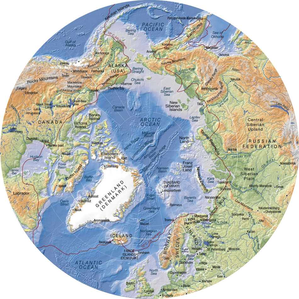
To illustrate, we will track the Arctic changes prior to the storm and warmth till December 28, 2016. However, first here is an Arctic map to assist with location finding.

Source: https://nordpil.com/static/images/arctic_topographic_map_full.jpg

What follows mostly comes from the EOSDIS World View Sea Ice Concentration Layer interspersed with other charts by date to illustrate the drop, the heatwave and then the fast expansion of extent and concentration changes since the strongest storm passed on the 23rd.

December 1, 2016

Beginning with December 1, 2016, below, we observe the Franz Joseph Islands nearly surrounded by sea ice as the pack continues to expand. Areas of the Kara Sea remain ice free due to ocean warmth slowing refreeze.

To illustrate that sea surface temperature anomaly slowing refreeze here is the NOAA EMC SSTA for December 1st:


Source: http://polar.ncep.noaa.gov/sst/ophi/archive/20161201/color_anomaly_NPS_ophi0.png

December 14, 2016

The image below for the 14th reveals the sea ice extent and concentration just before a series of storms and wind change that reversed the winter expansion on the Atlantic side. The concentration anomaly in the Central Arctic Basin remains though somewhat diminished.


December 22, 2016

The imagery for the 22nd reveals the impact of the winter storm, wave action, and strong winds impacting the sea ice. The pact around Franz Joseph Land has been shredded, and north of Svalbard concentration has dropped.


The wind and temperature impacts for the 22nd are apparent in the earthnullschool imagery. The low passing west of Svalbard pulled the warmer air flowing from the south into the Central Arctic Basin, and that combined with the winds exceeding 50 mph swirled over the pack from northern Russia.

Source: https://earth.nullschool.net/

December 23, 2016

The strong low pulled the mid-latitude air over the Pole, with temperature anomalies that were 20-30 C above normal, a couple of brief hours hovering at 32 F.

 Source: Climate Reanalyzer

December 24, 2016

Christmas Eve revealed the furthest retreat of the sea ice edge and obliteration of ice around Franz Joseph Land, with the additional weakening of the sea ice inside the pack appearing as yellow areas with about 75% ice. The storm, wind and wave impacts were ending, and with that, refreeze would begin rapidly.


December 28, 2016

During the last four days, much of the extent lost has been recovered - but with thinner ice that will continue to suffer the effects of wind, warmth and waves. Concentration in the Central Arctic is still ragged, with a pack on the move through the Fram Strait being impacted by current and future wind and storm. First, here the EOSDIS sea ice concentration for the 28th.

Source: https://worldview.earthdata.nasa.gov/

Here is the Magic Seaweed forecast for waves and storm impacts for today as of 1800 hours, Areas in yellow and orange represent wave heights over 20 feet.


Source: magicseaweed.com

Warmth still streams north along with this storm, here is a more local view first, then the "conveyor belt" of air flows that keep pummeling the Arctic over the next several days with moisture and warmth from the mid-latitudes. Areas in green and yellows are above freezing. Blue and fucia/purple are below freezing.


Source: EarthNullSchool

Finally, here is the wave forecast for January 1, 2017, which conveys that what we have witnessed as warm stormy conditions impacting Arctic sea ice will likely continue into January. The light blue and aqua still represent wave heights of 10-18 feet.

Thus, we begin 2017 with a weakened pack, that continues to be a shadow of its former strength. This state is reinforced by the recent AGU Norwegian Young Sea Ice (N-ICE2015) project presentation.

As Mats Granskog, a sea-ice researcher at the Norwegian Polar Institute in Tromsø and chief scientist of the Norwegian Young Sea Ice (N-ICE2015) project, presented at the AGU conference, there were...

“Lot’s of surprises. We saw a new Arctic where the ice is much thinner, only three to four feet thick and this ice functions much differently than it did five to ten years ago when the ice was much thicker.”

“We were also surprised that there was so much snow on the ice. Way more than we expected from earlier work."

“We observed the first northern most under sea ice phytoplankton bloom very early in the season when the ice was still snow covered. It was only this new Arctic ice, very mobile ice, that allowed this to happen."

"So we can say that this thinner and younger ice today works very differently than the ice we knew. It moves much faster. It breaks up more easily. It is way more vulnerable to storms and winds."

“The so called Arctic Amplification, the rapid warming of the Arctic, is in part caused by a reduction in the Arctic sea ice, seen in the last decade. And this has already impacted the patterns of weather and climate on the planet.”

"It is disturbing that the accelerated warming in the Arctic actually feeds more warming in the Arctic, and can even result in more drastic changes. And these drastic changes in the Arctic sea kind of calls into the question the knowledge that we have today about Arctic sea ice.”

Source: Youtube AGU https://www.youtube.com/watch?v=Fq-d6RjPjoQ&t=774s

To visualize his description, here is a glimpse of the current ice conditions, note the leads through the Central Arctic basin.


Finally a closeup glimpse of the Nares Strait, and fracturing through the older sea ice in the Canadian Arctic.


Source: Environment Canada